Hobo Hotel Oslo - custom made textile
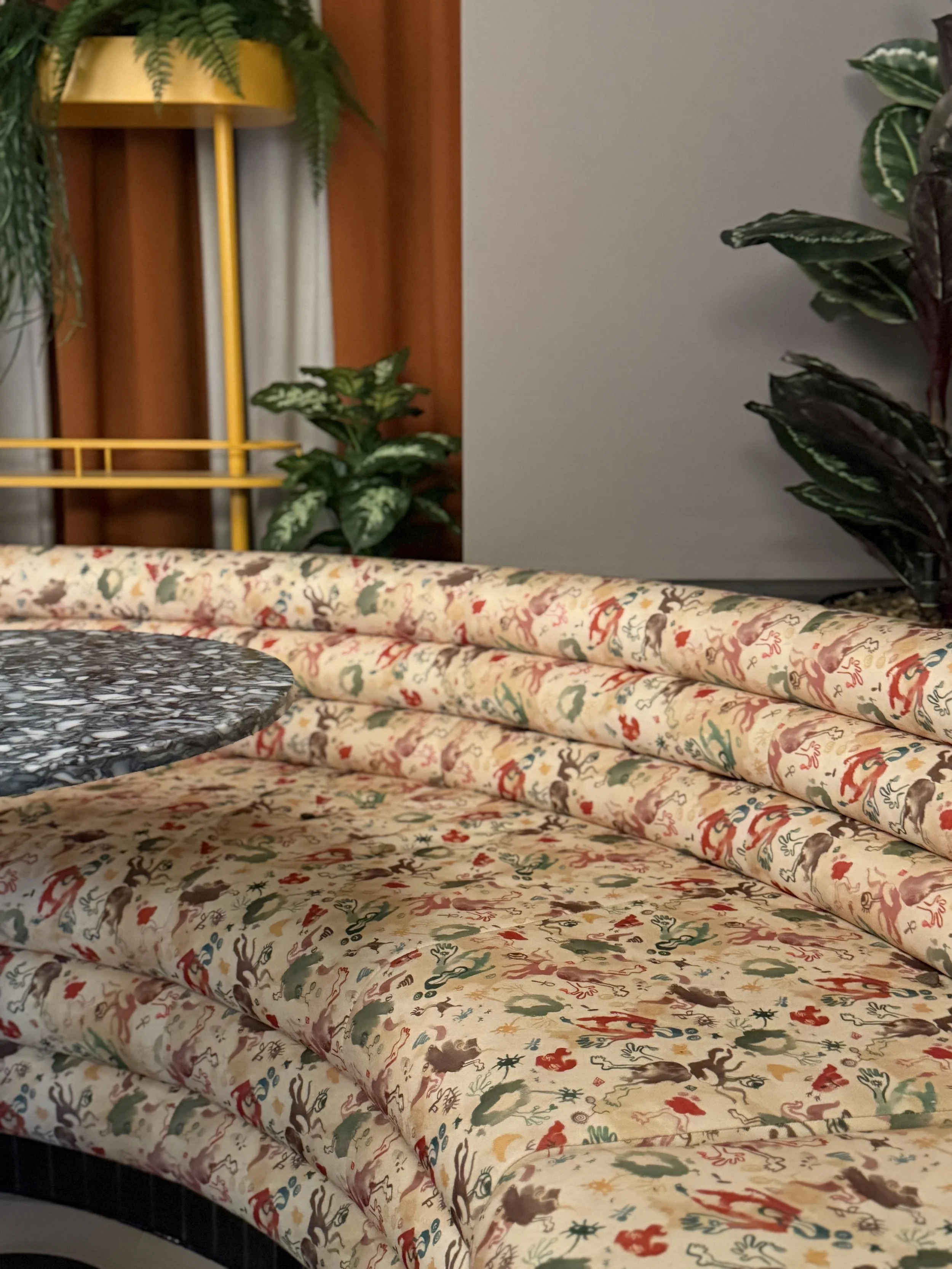
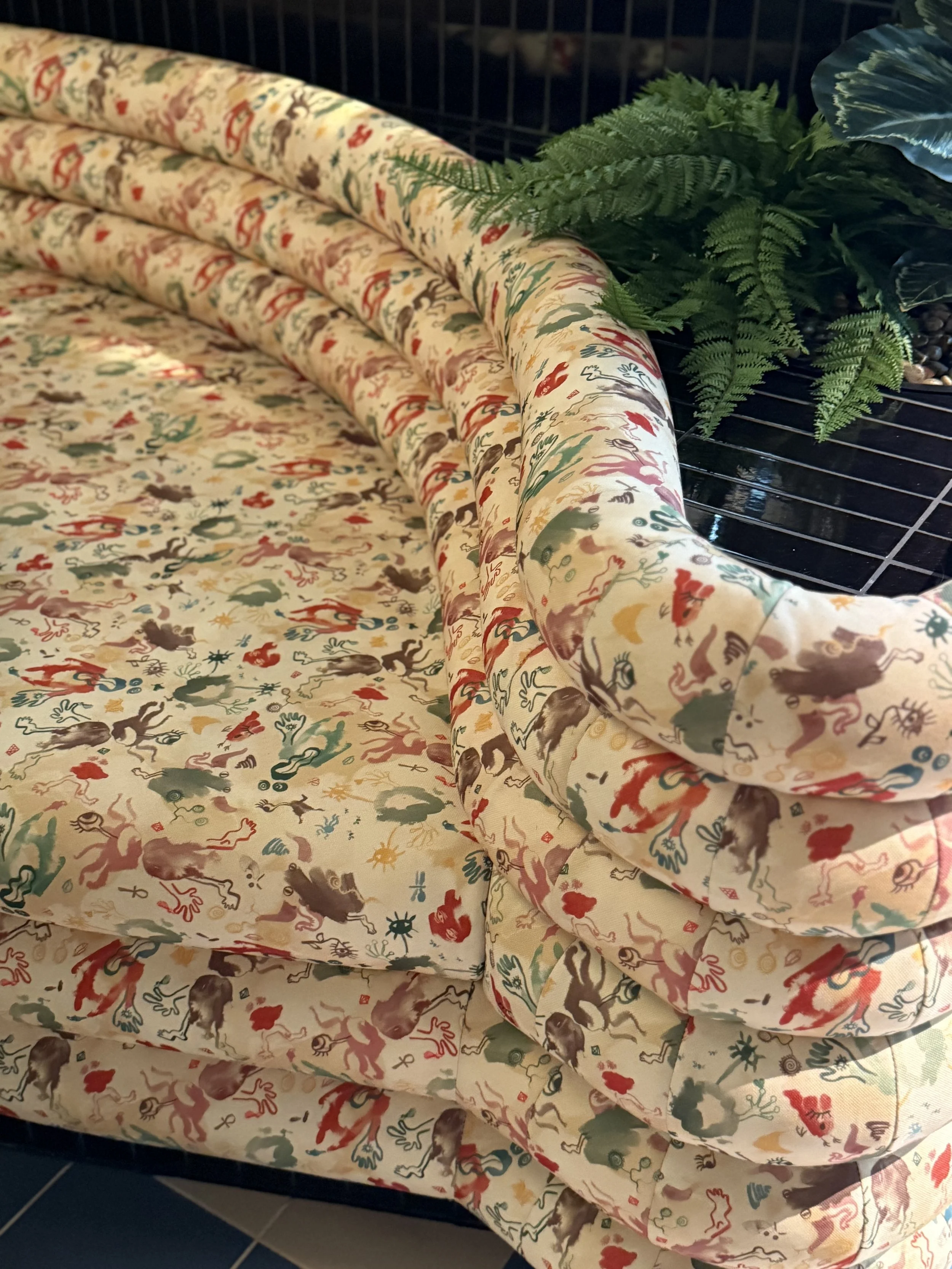
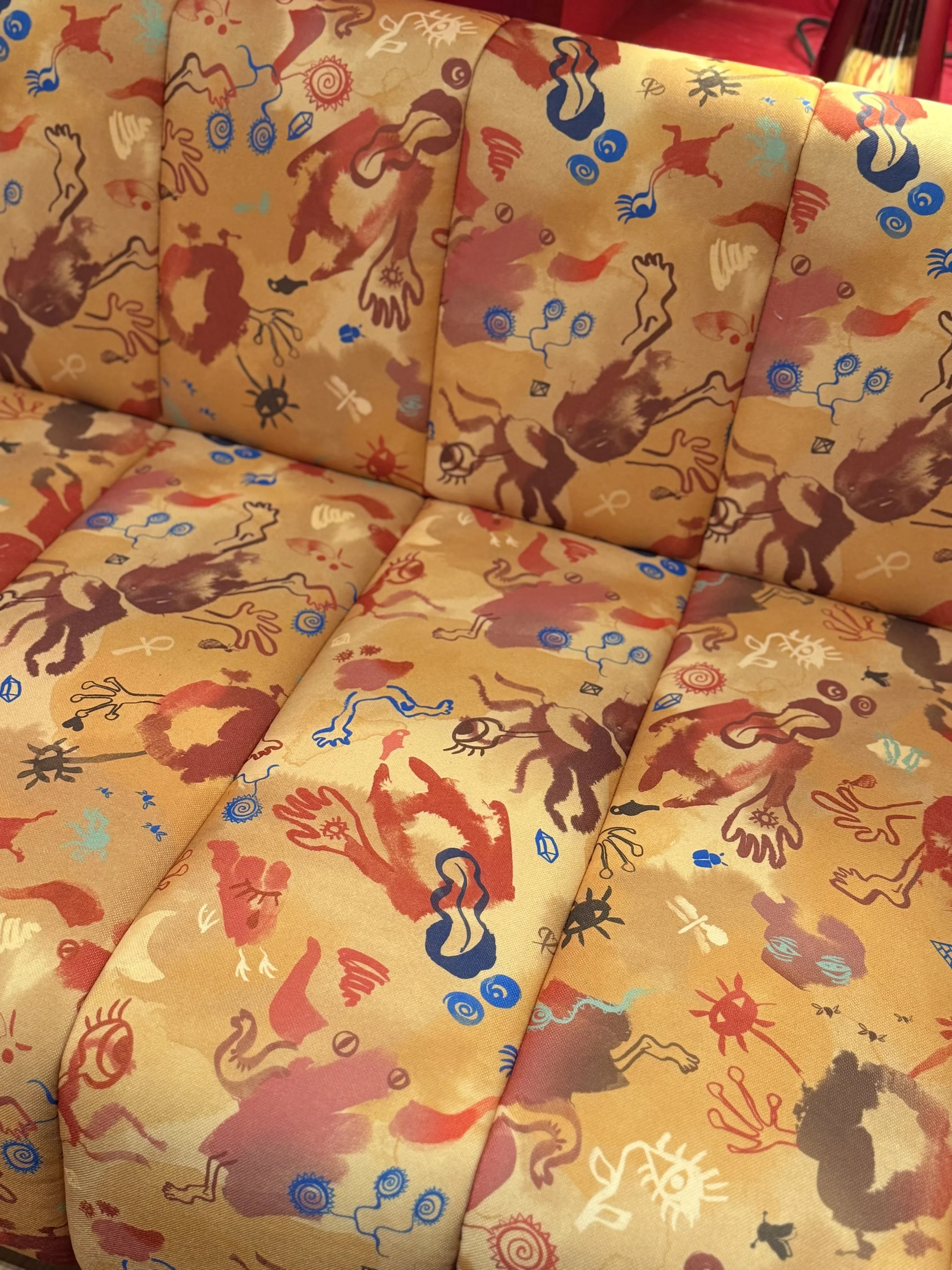
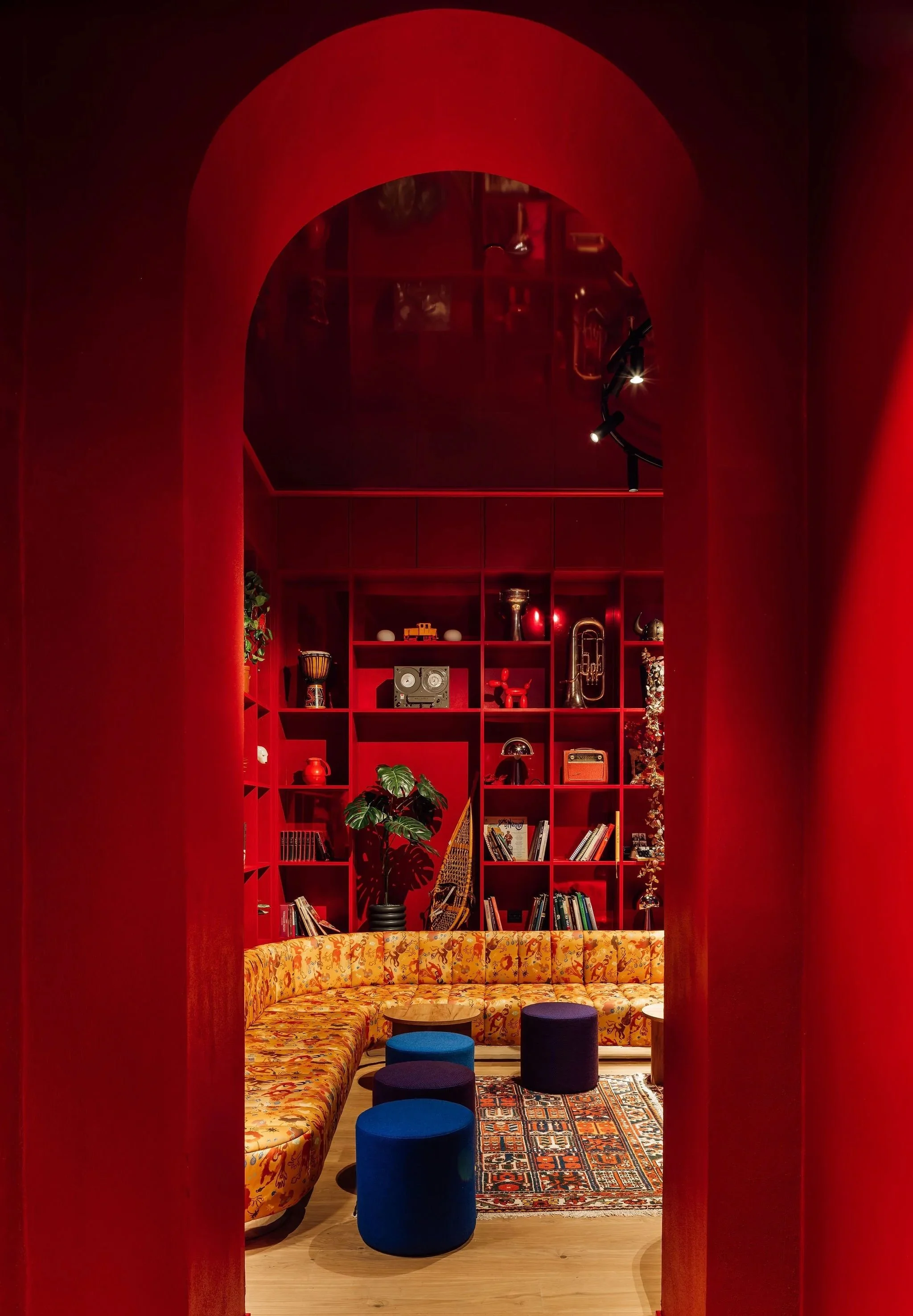
When you sink into the sofas at Hobo Hotel Oslo, you’re not just taking a seat; you’re stepping into an artistic universe. Print designer Kiki Plesner-Löfroth is the creative force behind the colorful textiles that shape the atmosphere in the hotel’s restaurant, library, and outdoor terrace.
How was it to collaborate with Hobo Oslo?
It was incredibly fun. I was asked to create a pattern that expressed the Hobo universe: playful, colorful, and different. The result was a series of characters that represent different personalities; the kind, the curious, the festive. These small, almost mythological figures invite you to connect with them. I worked closely with Studio Aisslinger and the Hobo design team.
The textiles are now featured on four large sofas in the main restaurant, as well as in the library, in a different color palette. On the terrace, guests can wrap themselves in blankets I designed, inspired by traditional Norwegian patchwork, but reinterpreted in a modern way. They are woven at Grinaker Vev in Norway, combining local craftsmanship with a fresh design language.
Can you describe your creative practice?
I run Plesner Patterns, designing textiles and wallpapers, often produced locally in Norway. My work always starts in an analog way with brushes, ink, or objects I find, before I move the process digitally. This leaves traces of craftsmanship and an imperfect charm. I am inspired by nature and small everyday moments. For me, patterns are about shaping our surroundings and creating something people can drift into; a visual journey that offers a mental pause.
What do you want guests to experience when they see your work at the hotel?
I hope they notice the details. Maybe not immediately, but over time, as they sit and discover new figures and colors. I also want my patterns to spark joy and curiosity. That’s exactly what makes a design hotel or boutique hotel in Oslo and other cities special; it takes you into a unique universe, offering an experience you won’t find anywhere else.
Read the Design Feature in Kreativt Forum
Read the Hobo feature in NæringsEiendom
————
“Working with Kiki at Plesner Patterns has been an inspiring process from start to finish. Kiki took our input and interpreted it in a surprising way—with delicate brushstrokes she created an expression that is both distinctive and vibrant. Committed and eager to find solutions, she worked with an openness and creativity that made the collaboration both rewarding and playful.
The result is textiles that not only add aesthetics to the space, but also a story—a visual universe of beings that give life and character to Hobo Oslo. We are incredibly proud of what we have created together and grateful for her artistic vision and dedication.
Thank you so much, Kiki, for the inspiration and the wonderful collaboration!”
Anette Rønneberg, Project Manager for Strawberry, Project Hobo Hotell Oslo
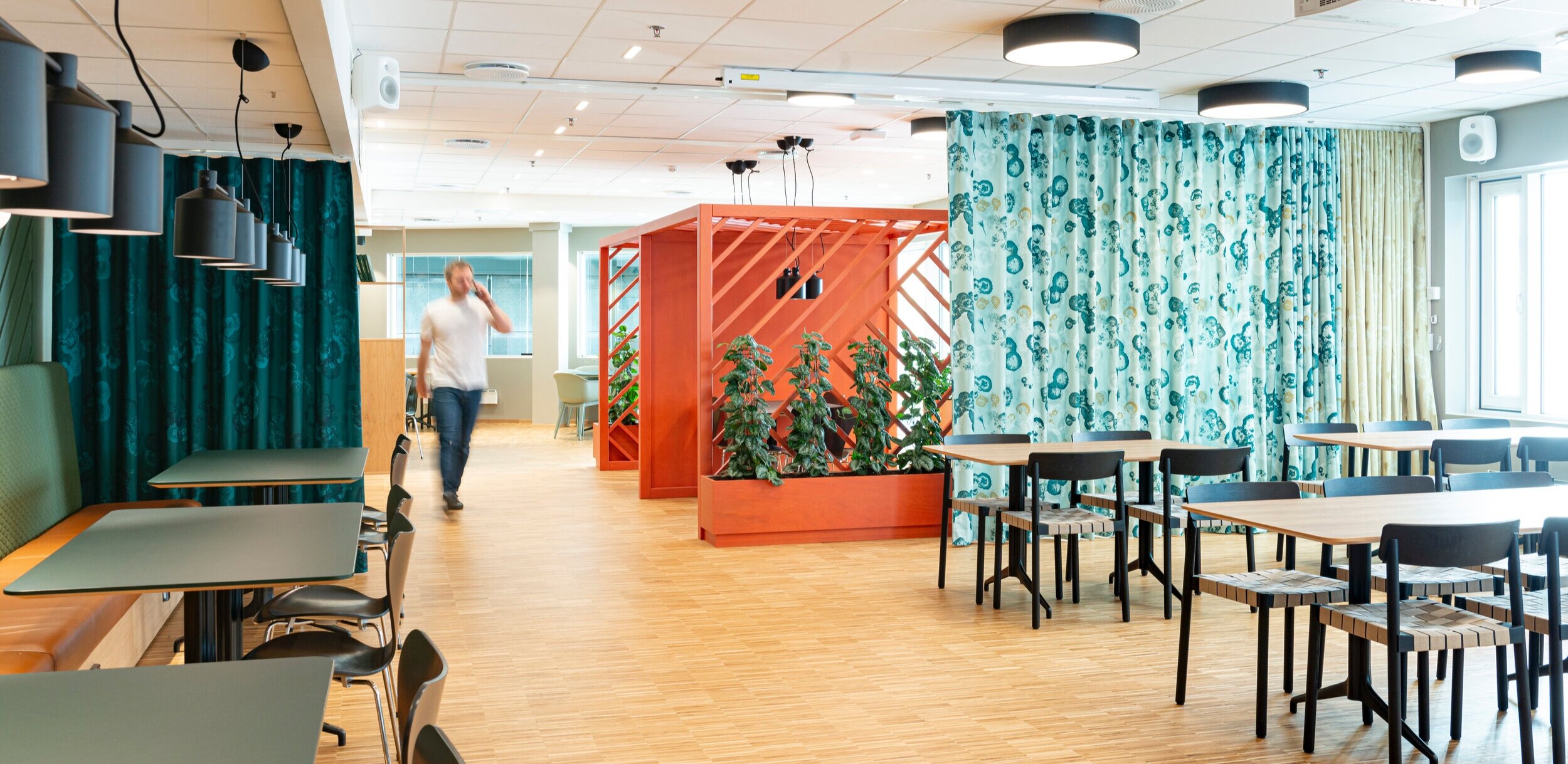

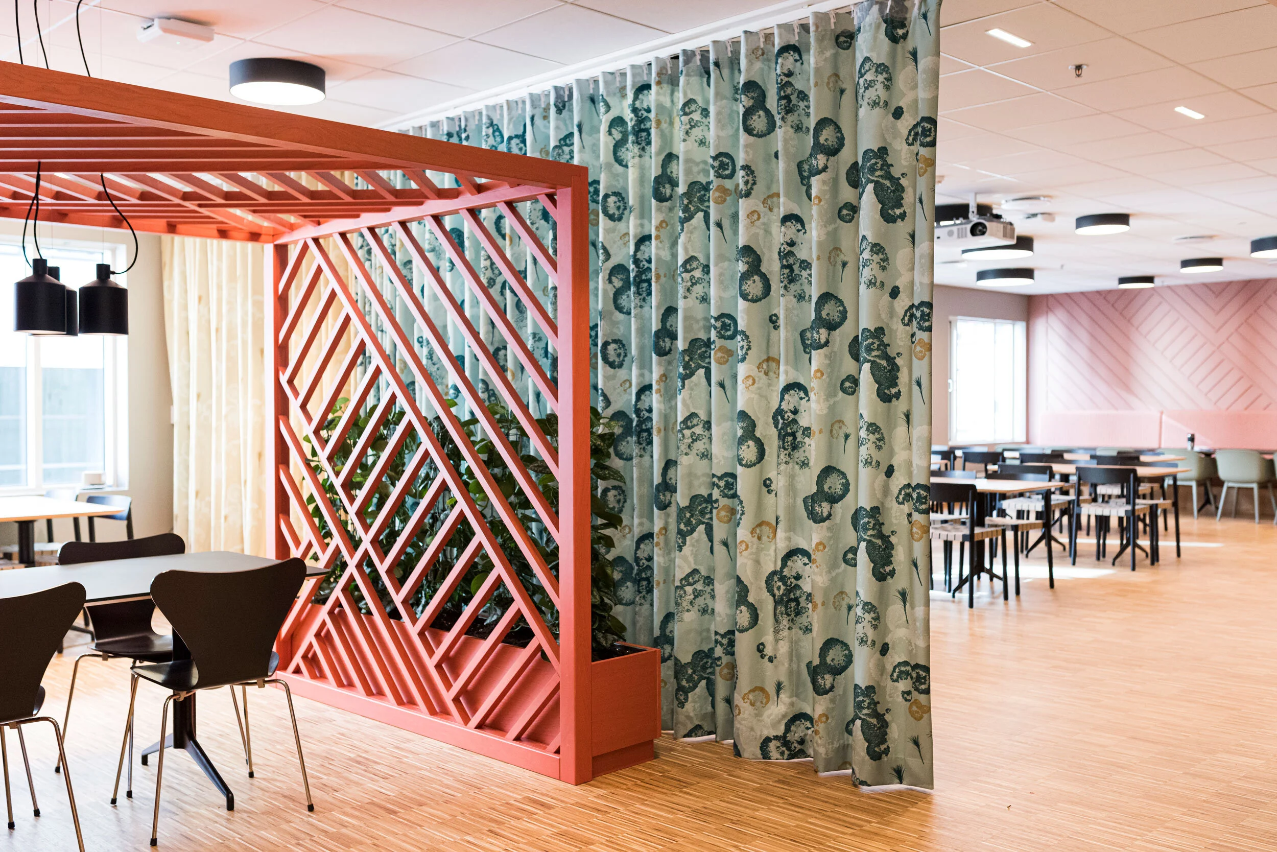
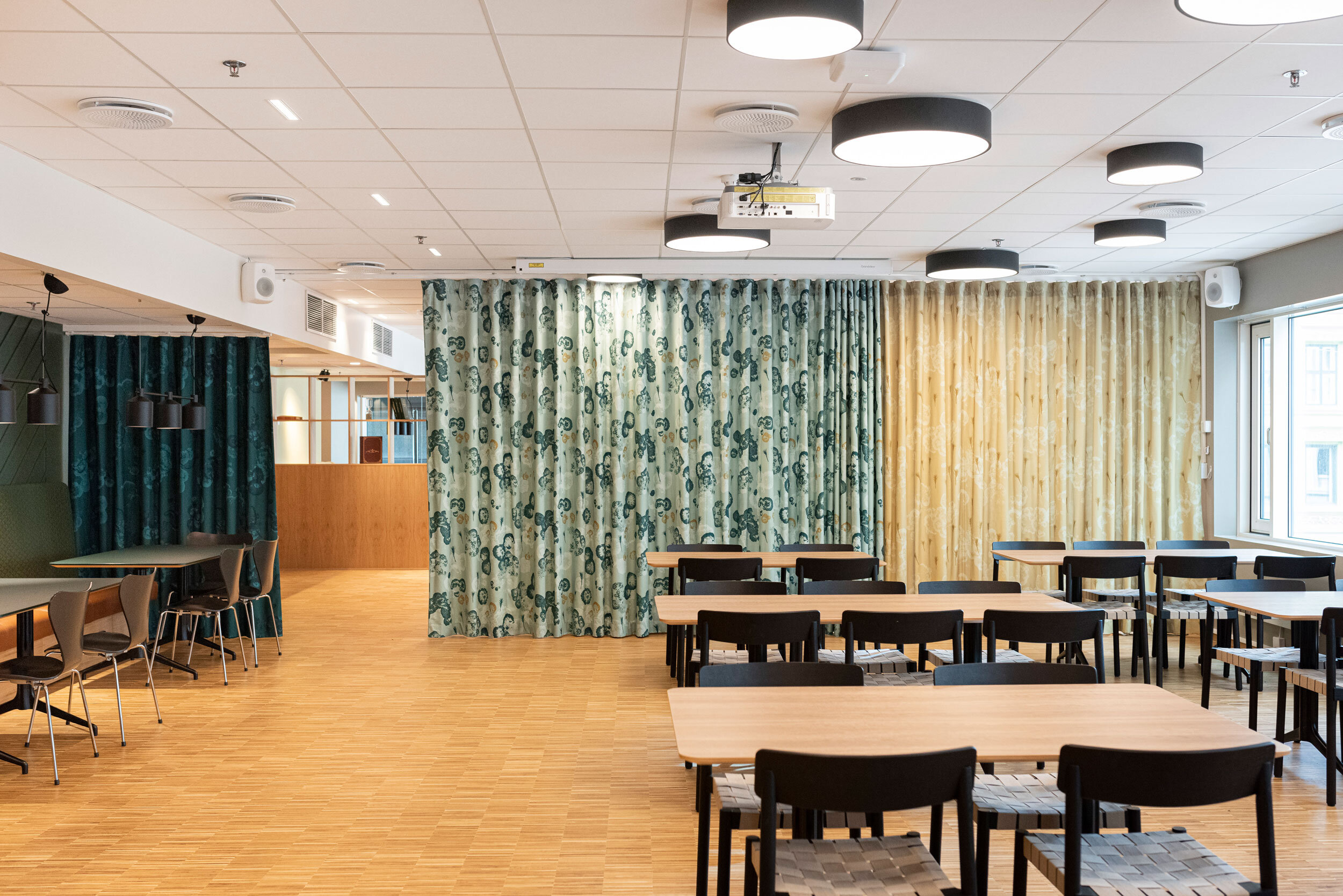
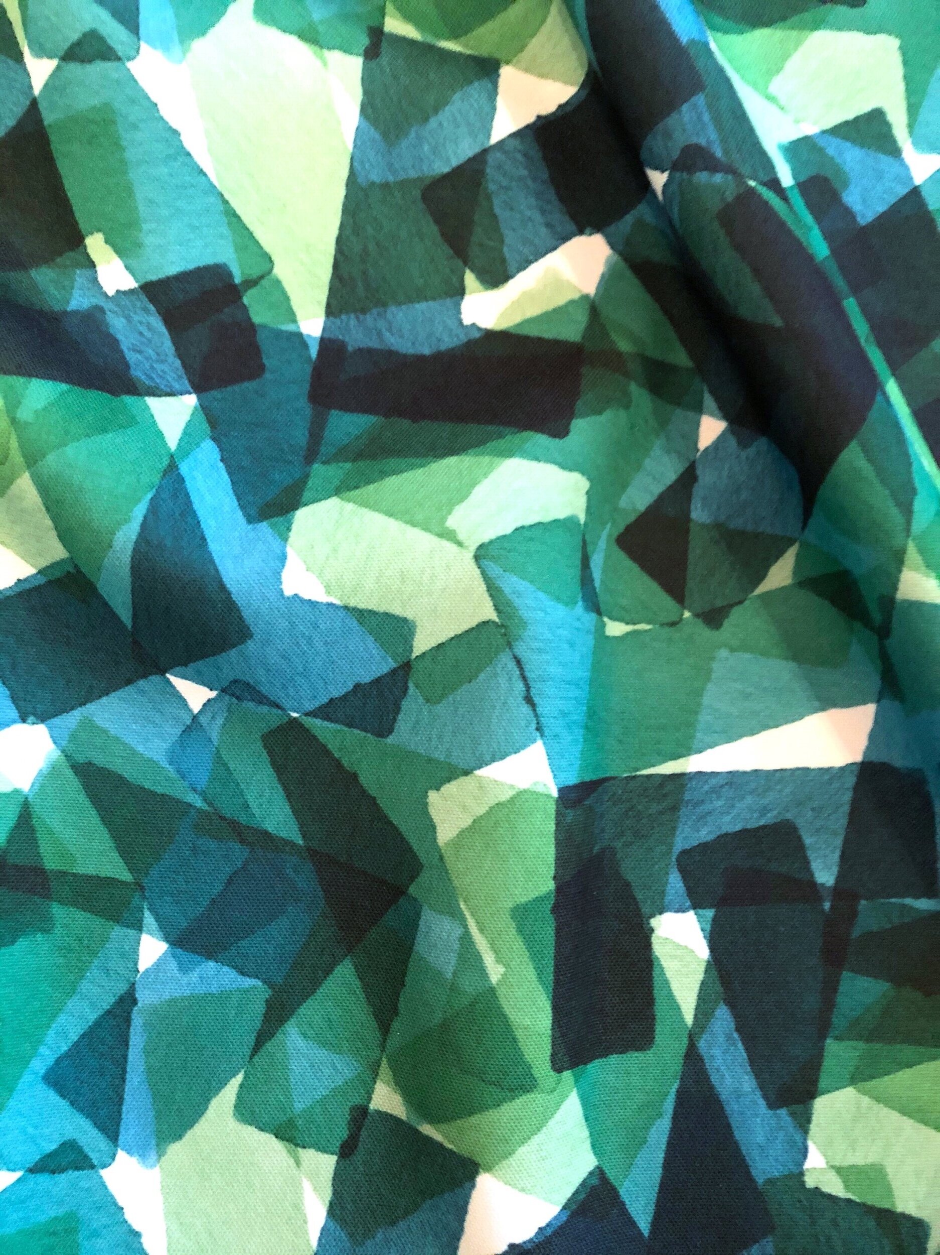
Art-curtain in Fremtind’s canteen
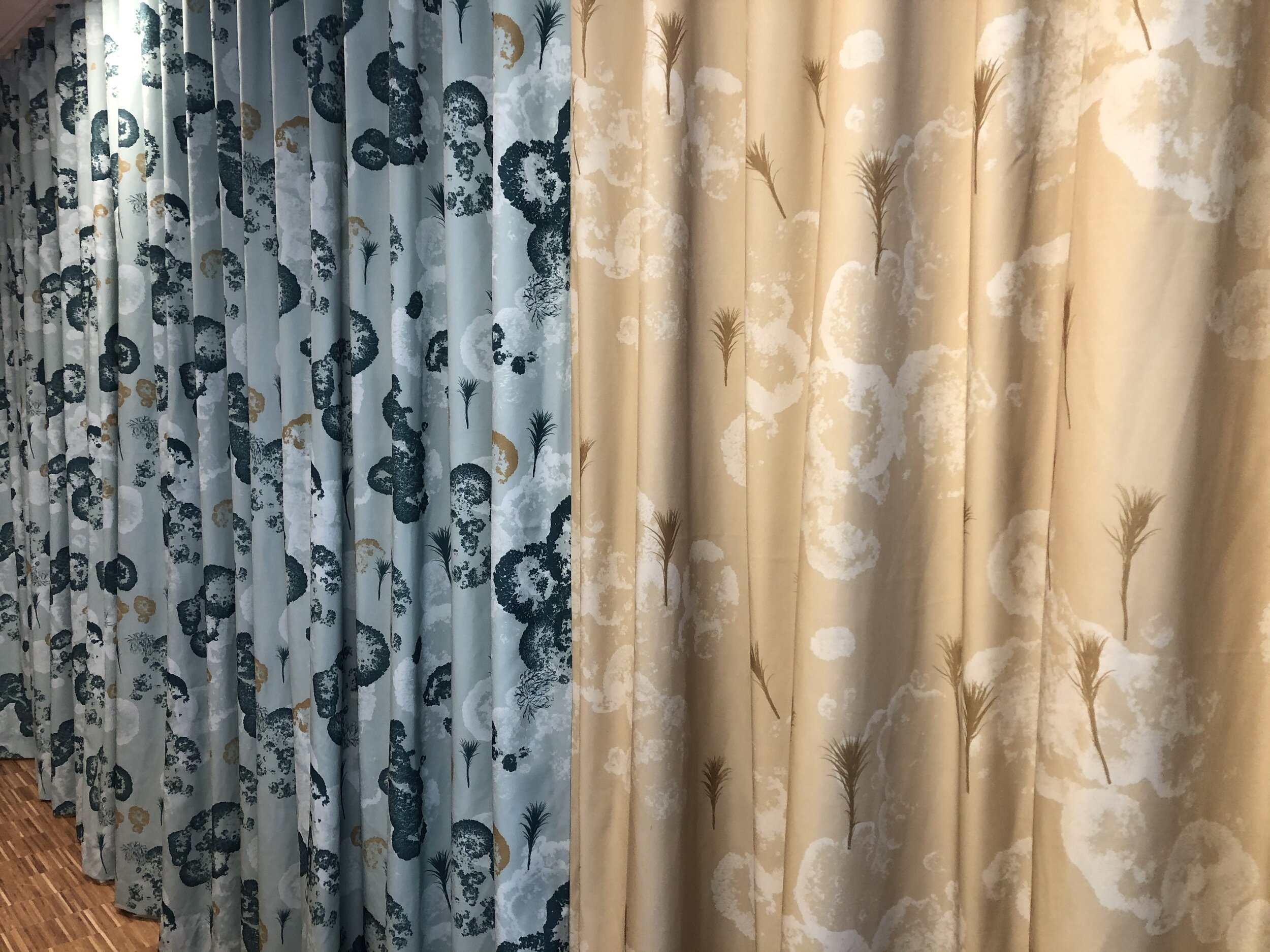
A custom made pattern designed for Zinc and Fremtind. It is a big room divider in the insurance company Fremtind’s canteen. The brief from Zinc Interior Architects was to emphasize nature, traces of lived life and the different stages of life. The result is a threefold curtain with 3 designs representing the stages of life: kid, young and elder.
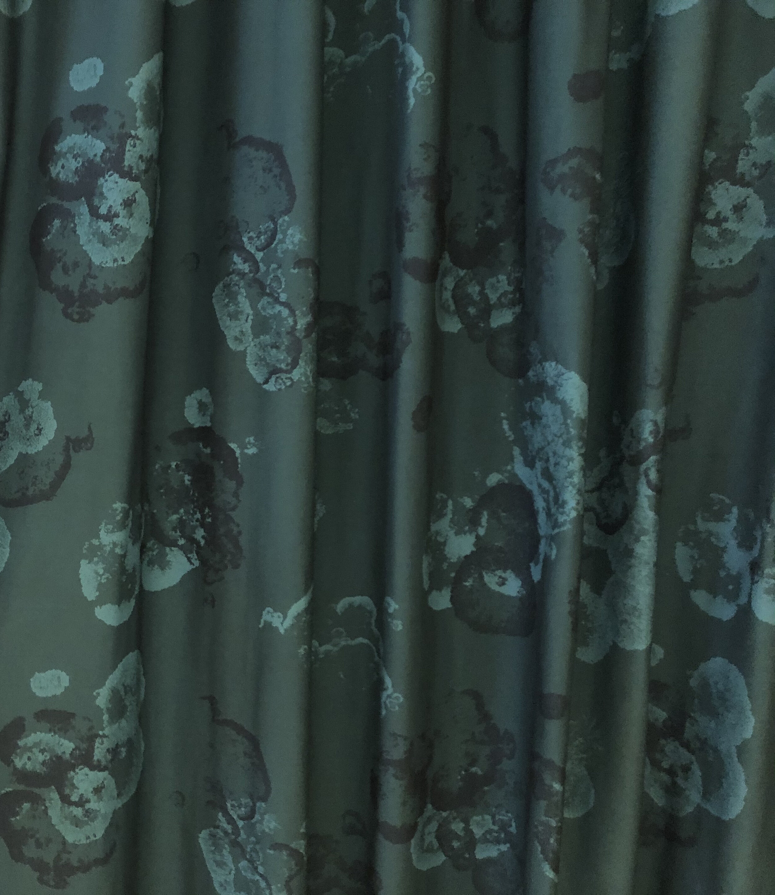
Kids represented by the yellow design with small sprouts reaching towards the sun. Young is more hectic, more happening in these busy years of life. The main colour is light green as the colour of hope. Elder is represented by the dark green design panel. It’s calmer, slower, and indicates traces of memories.
The pattern is inspired by moss, which is slow growing, can withstand a lot, and leave visible traces of lived life. The colours are harmonized with the colour pallet and the materials Zinc selected for the interior of the canteen. Such a fun project to work on!
– Kiki took our concept, our thoughts and values, and turned it into a piece of art – a curtain that is now one of the jewels in our canteen.
Mette Boquist, Director Fremtind
– Kiki er kreativ og tilpasningsdyktig i henhold til å videreføre ett allerede etablert konsept, lytte og gjøre endringer ved tilbakemeldinger. Prosessen har vært spennende og resultatet blitt veldig bra. Det tilfører lokalet akkurat det lille ekstra vi håpet på.
Therese Haaland Jonassen, Interior architect, Zinc
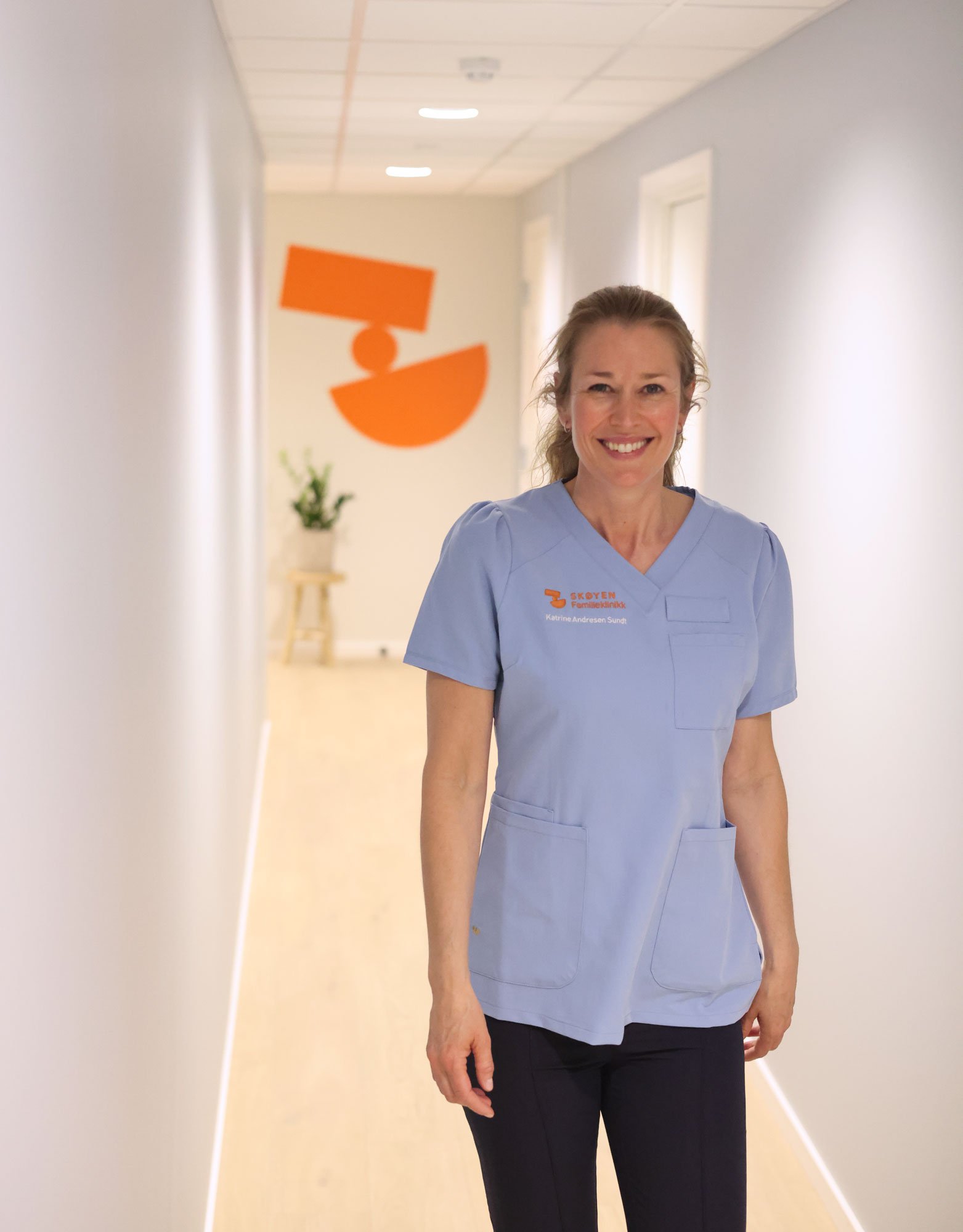
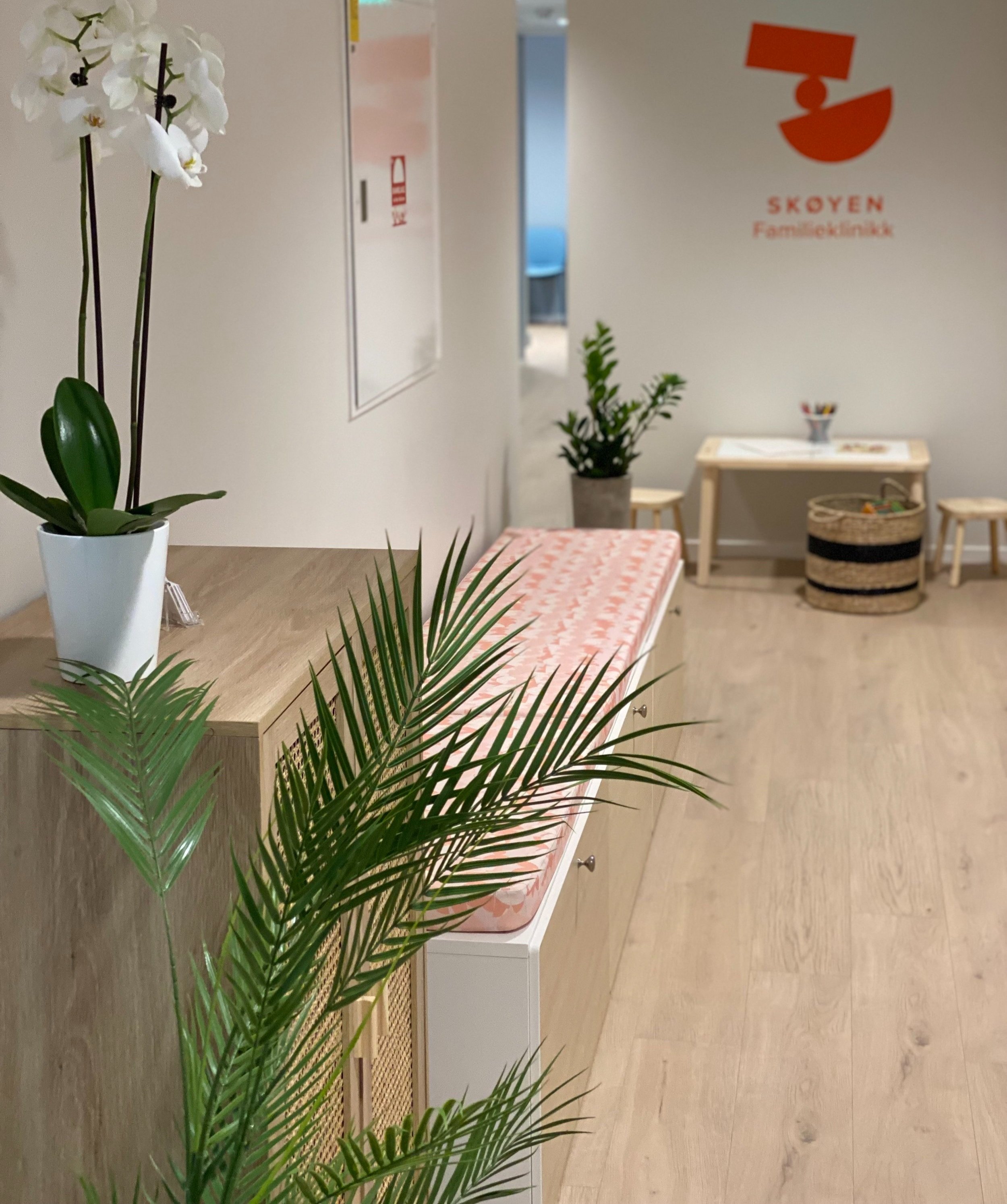
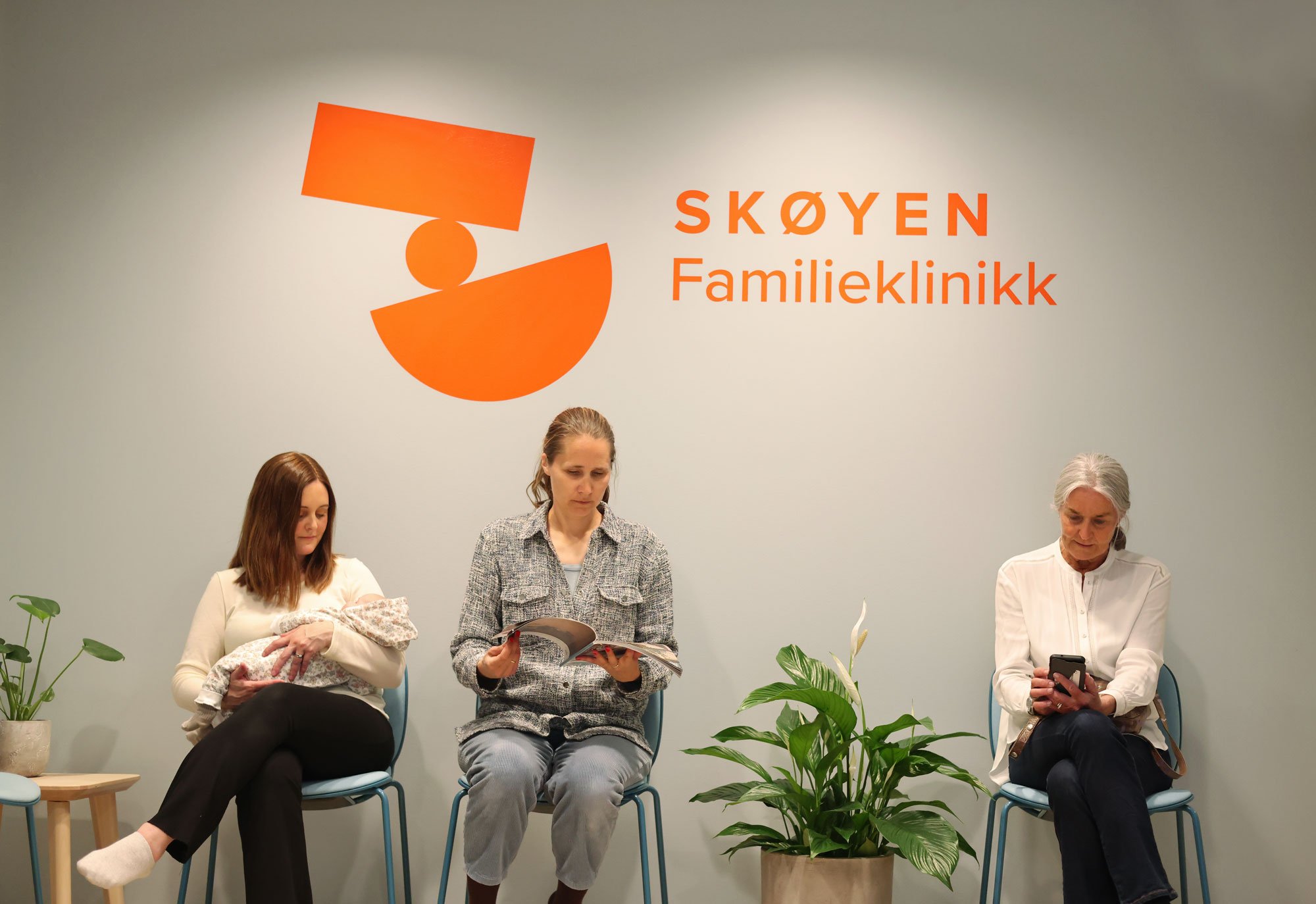
Custom made pattern for Skøyen Familieklinikk
Logo and textile pattern for Skøyen Family Clinic offering chiropractic treatments for all ages, specialized in baby and pregnancy, and neuro chiropractic treatments for dizziness. The logo symbol emphasizes the role of balance and equilibrium. The pattern is a subtle extension of the logo, using the same design language.
The brief of the over all visual identity was to emphasize a positive energetic feeling, and convey human competence with a visual language that feels inviting and available.
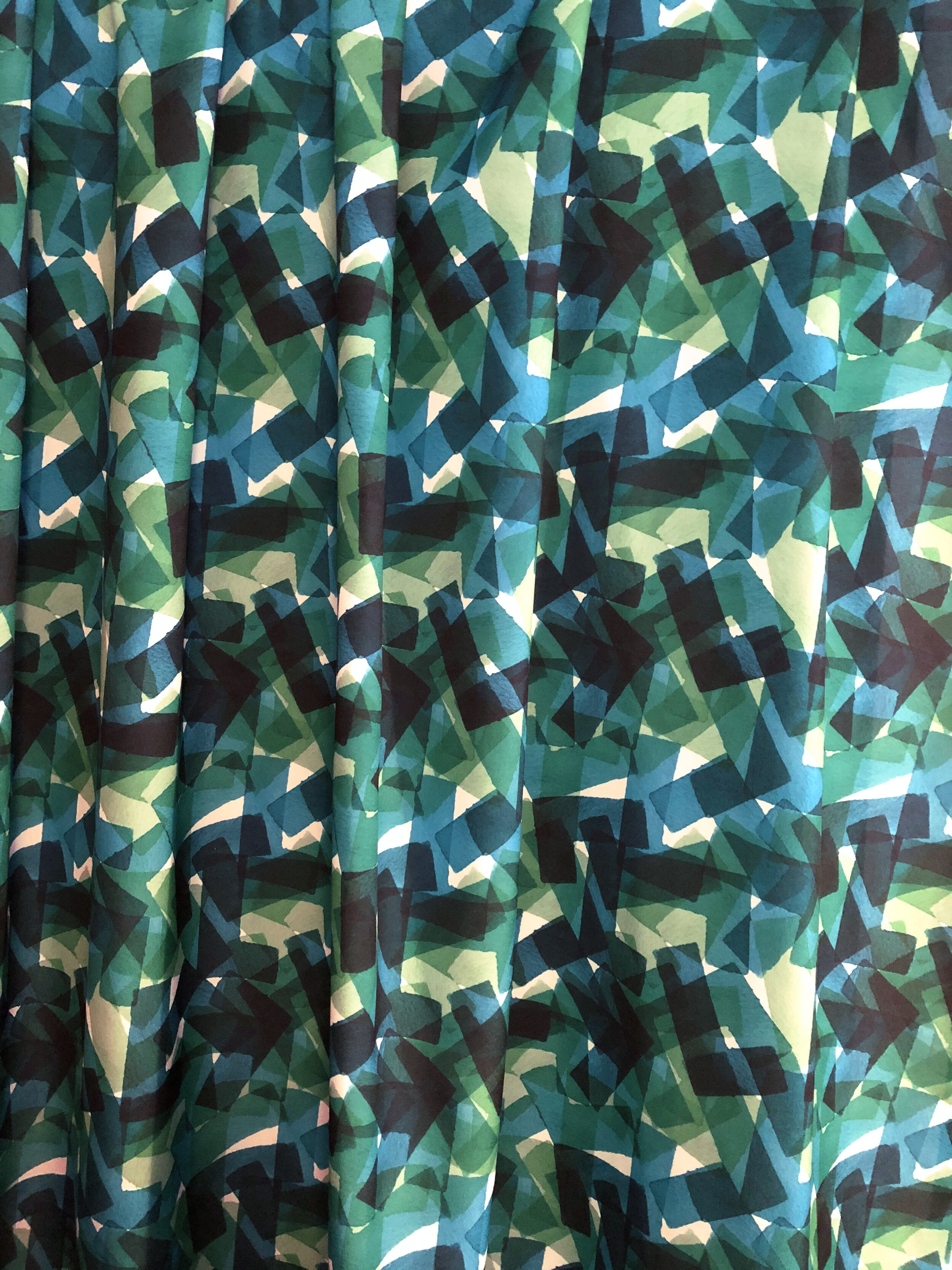

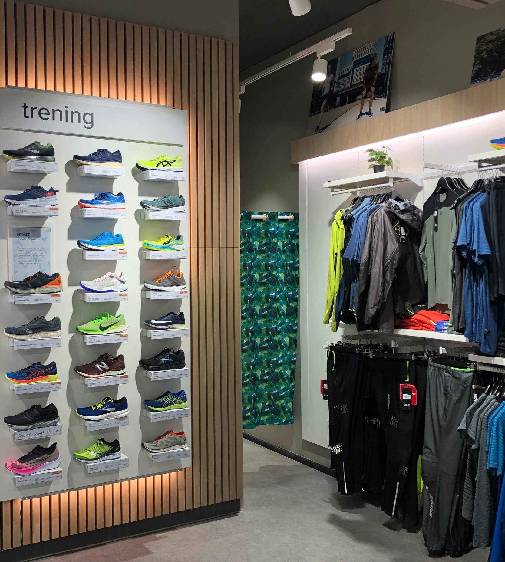


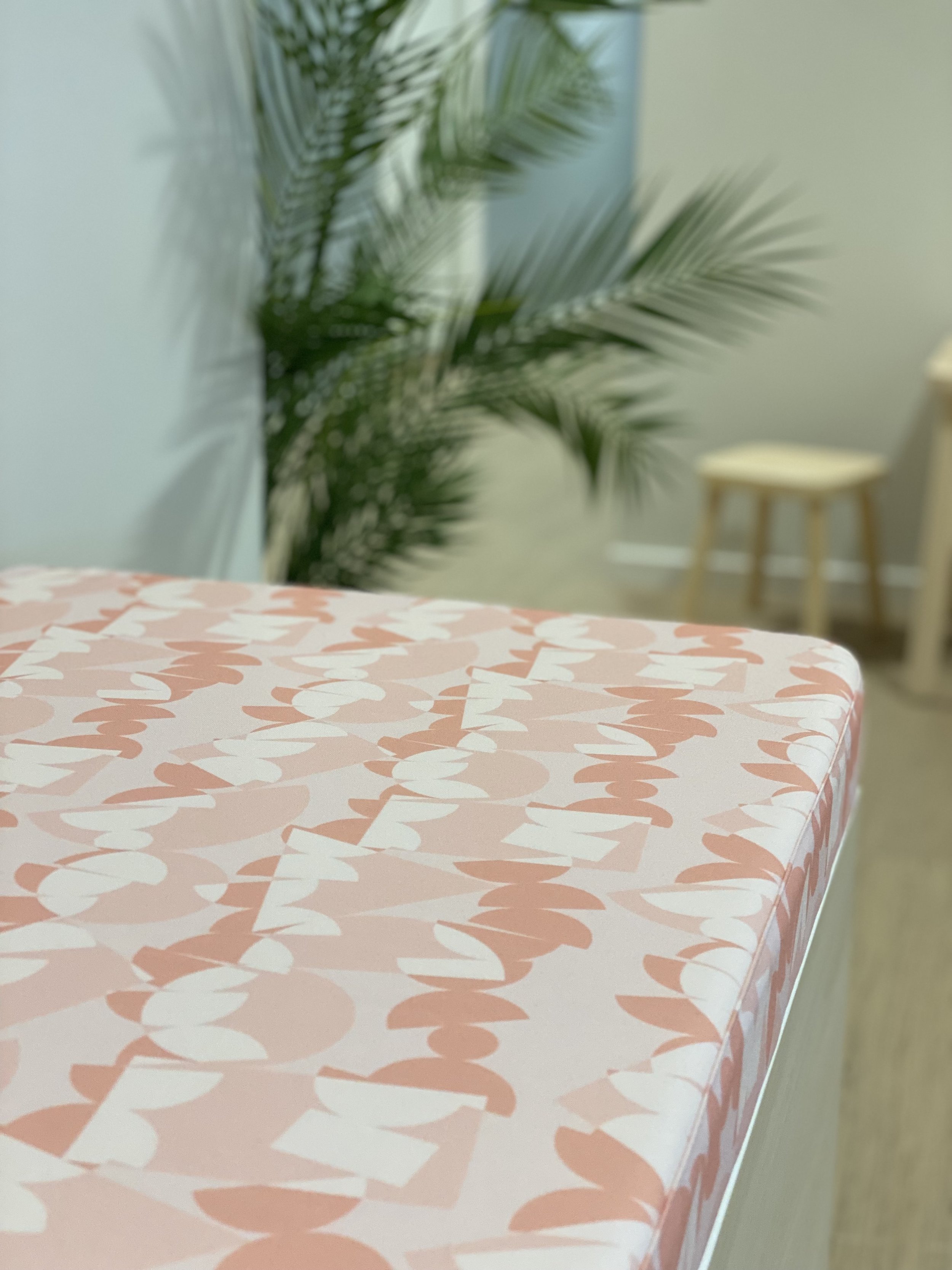
Brand pattern created for Löplabbet
Löplabbet’s stores sell professional runners shoes. The pattern is based on the logo and visual identity. The pattern works as an extension of the visual identity. It conveys runners joy which is a core value together with the high technical expertise they stand for. It creates a uniform and strong visual impact and continuity. The curtains for the fitting rooms (as shown above) are made in a colour palette that harmonize with the interior concept of the stores. Photo: ByAksel
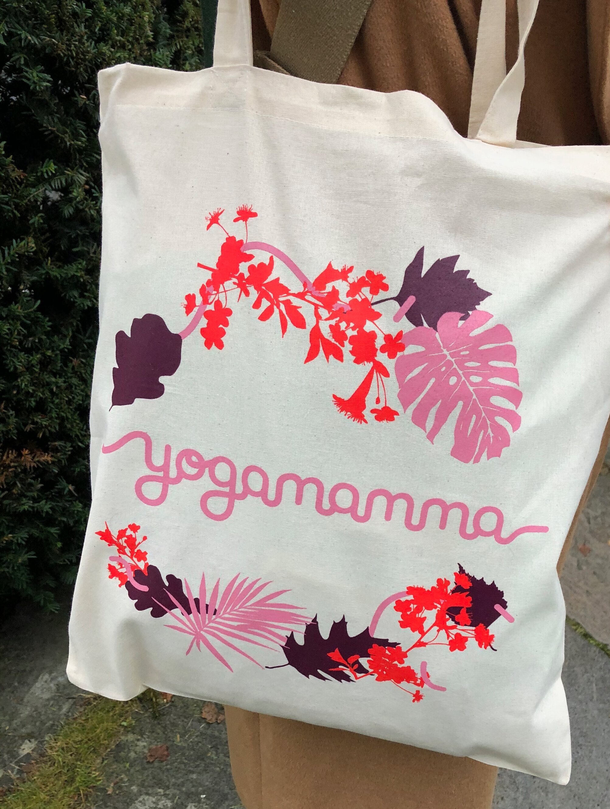
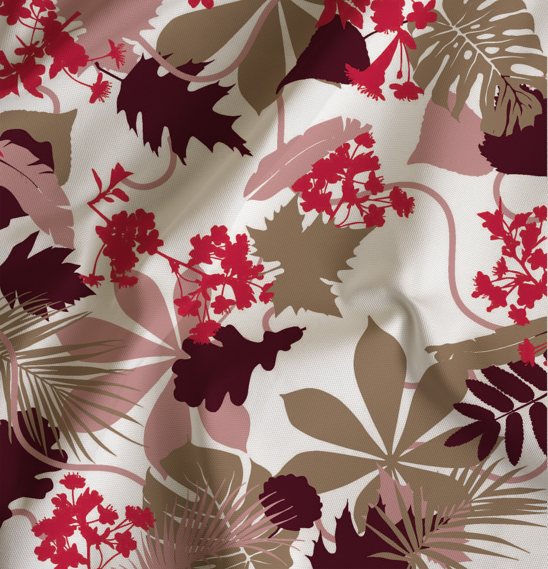
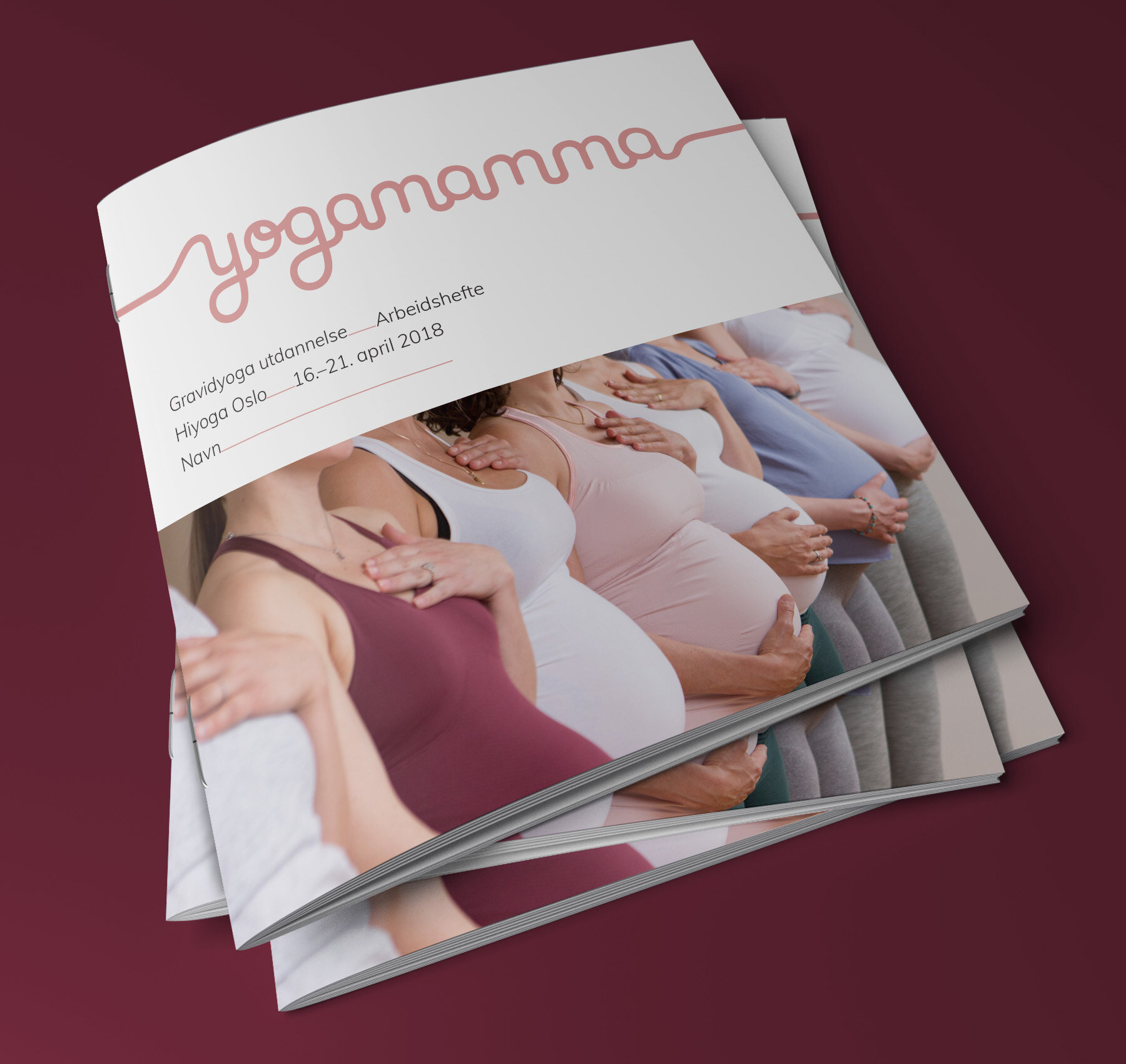
Yogamamma’s brand pattern
The visual identity wants to demystify and make yoga appeal to more people. It's about taking yoga into your everyday life and using it as a tool in life. The visual profile has references to the established visual yoga language through the soft pink color and the shapes, but at the same time is bolder and more powerful to emphasize the feminine strength. The continuous line in the logo symbolizes the journey – you come from a place in life and into pregnancy and motherhood, life goes up and down, then you come out again on the other side.
A distinctive pattern has been developed that incorporates the organic lines from the logo combined with the elements of nature. The line in the logo is continued in the typography layout and provides an association to continuity. The color palette represents the natural, feminine and power. Visual identity by Studio Plesner
Awarded

Partners and colabs


